Since we’re on the subject of reds, I have a few other red Gelish swatches that I haven’t posted yet. Red-y and Waiting is only available in MINI size. Spicy Fortune is a limited edition color from the Year of the Dragon collection. These two colors also look very similar to Hot Rod and Red Roses. I don’t see the need to own all of these reds – one of the 4 will do. ![]() And Just in Case Tomorrow Never Comes is a bright red, but it has a shimmery finish. This one is similar to Queen of Hearts except it’s lighter/brighter.
And Just in Case Tomorrow Never Comes is a bright red, but it has a shimmery finish. This one is similar to Queen of Hearts except it’s lighter/brighter.
Gelish 2013 “Winter Reds” Swatches
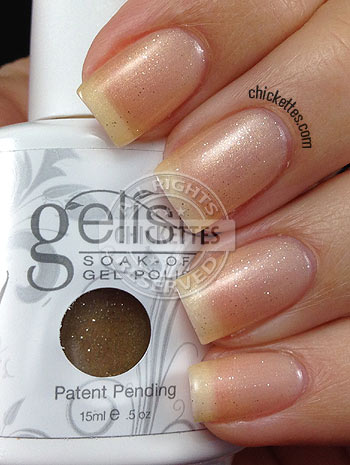
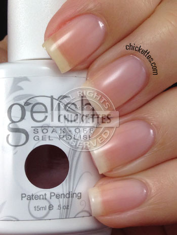
Gelish Wicked & Simpler Sheer Swatches

I almost didn’t swatch Simpler Sheer because it’s just a sheer/clear polish with a pink tint. But for the sake of swatching all of the Gelish colors, I did it anyway. Sorry, this isn’t very exciting! Personally I would skip this polish and just apply a layer of base, and a layer of top coat if you want a clear gel polish overlay.
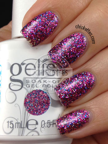
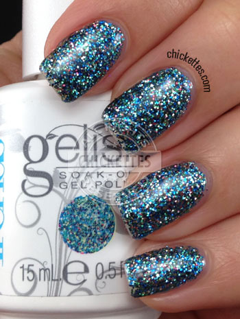
Gelish Trends: #PartyGirlProblems, Getting Gritty with It & Are You Feeling it?

Don’t miss my short video at the bottom of the page to see how these gorgeous glitter toppers sparkle and shine!
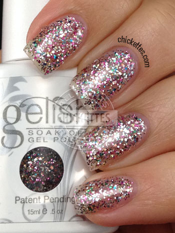
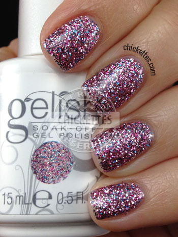
This is #PartyGirlProblems, which is loaded with different colored micro glitters. The most prominent colors are pink, blue and silver.
This is Getting Gritty With It, another dense micro glitter. This one has different shades of blue, a little pink and a little silver.
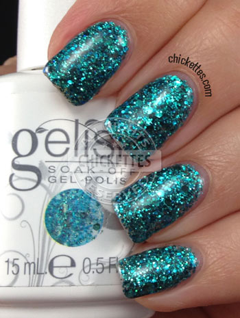
And the last one that I have for you today is Are You Feeling It?, which is loaded with different sizes of teal blue glitter. Teal is my favorite color so I’m actually going to wear this one for a couple of days. ![]()
And here’s a quick video that I made to show you how these beauties sparkle in real life!
Gelish Snow Escape Collection (Winter 2013) Swatches & Review

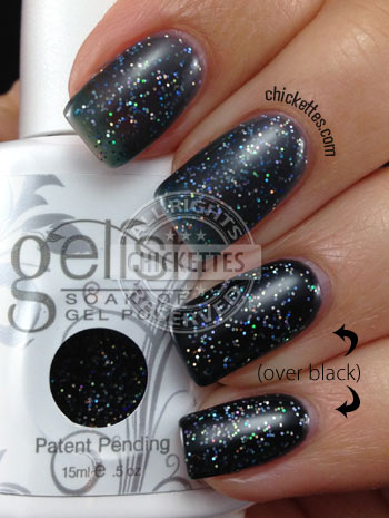
 360 Black Flip is a dark jelly base with fine holographic glitter. In this swatch I applied 3 coats on the index and middle finger, and two coats over a black base on the ring finger and pinky. The base is very sheer and it would take a lot of coats to get it opaque, so I recommend layering this over other colors. The glitter is stunning, but it reminds me of Vegas Nights and I think the effect is similar to applying Vegas Nights over black.

 Sledding in Style is a glitter topper with multi-color glitter of different sizes. I think this would look great over another color like Let’s Hit the Bunny Slopes (below). This swatch is three coats with no base color underneath.
Race You To The Bottom is my favorite of the bunch. I’m sure you know by now that teal is my favorite color, so I couldn’t wait to get my hands on this one and it certainly didn’t disappoint! This is a gorgeous shimmery polish. I call a dark teal, but it really takes on different colors depending on the lighting. It’s very sultry. I was going to do some nail art for Christmas, but as soon as I saw this I knew I would be wearing it for the holiday. I can’t even bring myself to do nail art over top of it because I love it so much. <3<3<3 This swatch is only two coats.

 Wanna Share a Lift? is a glittery red jelly polish. My photos don’t do it justice because it really sparkles in the light. It is similar to Good Gossip and All Tied Up With a Bow in ways, but it’s a little darker than these two. I’ll post some comparison pics within a couple of days, so be sure to check back to see those. This swatch is three coats.

 I Heart My Instructor is a creamy dark blue – I think this is the darkest creamy blue out there. Let me know what colors you would like to see this compared with and I’ll take some pictures. I’m thinking of comparing it to Deep Sea, Caution and After Dark. This swatch is only two coats, so it it has really good coverage.

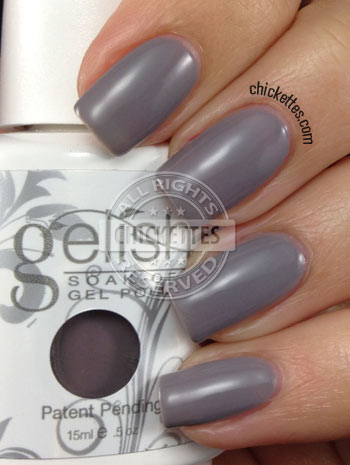
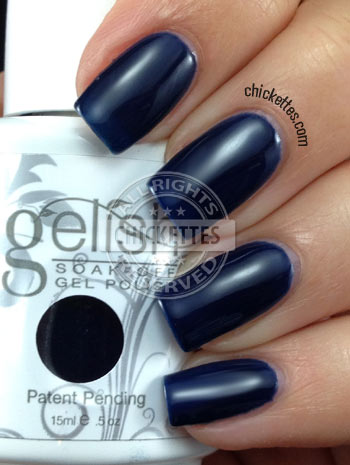 And Let’s Hit the Bunny Slopes is a creamy medium grey. I will post some comparison pictures of greys too, but this is definitely a unique color. It’s darker than Cashmere Kind of Gal and lighter than some of the other greys. It also has some slight blue-ish tones to it. I think it’s really classy. I haven’t had time to test it for fading yet, but I’ll be sure to post an update if I find any issues with the color changing.
Here is a short video that I put together to show the colors with some movement and lighting.
I haven’t found this collection for sale many places online yet, but it’s available here.
Merry Christmas everyone!
Gelish Snow Escape Comparisons

Let’s Hit the Bunny Slopes is the new creamy shade of grey that was released in this collection. You can see that it’s much darker than Cashmere Kind of Gal, and very different from the other existing shades.
Wanna Share a Lift? is the newest sparkly red, and I put this next to Good Gossip (the most popular sparkly red), All Tied Up, and a couple of shimmery reds for comparison. I’m surprised that Wanna Share a Lift looks so dark next to the other two. They are all 3 coats over a clear swatch stick. I think that Wanna Share a Lift just has better opacity than the other two because it doesn’t really look that dark on the nail. 
I Heart My Instructor is the newest shade of dark blue. It has better coverage than Midnight Cover and is a bit richer in color. Deap Sea has a bit of a purple shimmer to it. I couldn’t find my swatch of Is It An Illusion, but it’s also a very dark blue with a shimmery finish. Race You To The Bottom is also a new color in this collection. I struggle with classifying this one as blue or green, but I think it fits in better next to my green swatches than the blue ones, although I consider it to be a dark shade of teal. I’m still wearing this color and don’t want to take it off any time soon! I put it next to a green (Just What I Wanted) and a couple of teal blues to show you how it compares.
Gelish Trends – A Pinch of Pepper

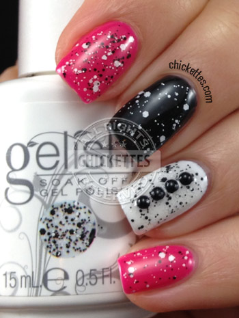
A Pinch of Pepper is a fun glitter topper that can be used over any color. Obviously if you wear it over white or black, you can’t see the glitter that matches the base color. I applied two coats of a Pinch of Pepper on each nail. Do you like it?
Gelish Trends – Concrete Couture

Gelish Trends – Let Me Top You Off & Rough Around the Edges
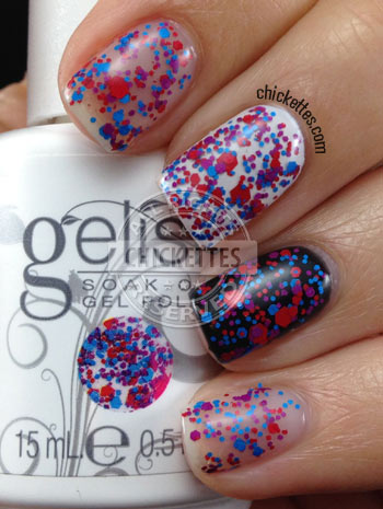 This next one is called Rough Around the Edges. I applied two coats of it over a plain nail, Artic Freeze, Black Shadow and Seafoam. I honestly don’t know if I can say anything nice about this polish. I didn’t like the consistency, it’s goopy and sticky and felt like I was applying oatmeal to my nails. And it’s definitely rough… even after applying a top coat my nails had a lumpy, bumpy texture to them. I like some textured polishes, but this didn’t do it for me. The iridescent flakies in this polish would be really pretty if they laid flat nicely. I heard that Fingerpaints is coming out with some flakie toppers in February, so I may have to try one or two of those to see how they compare. What do you think… would you wear this? I definitely won’t be wearing it again.

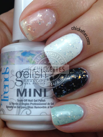 Here’s another shot of what it looked like on my swatch wheel… you can really see the texture here.
Gelish Trends – Sweet 16 & Girls’ Night Out
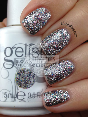
This is Girls’ Night Out. It’s also multi-colored but silver is the dominant color. I also see some specks of blue and red throughout. I really wish I could show you in pictures how truly sparkly it is. Soooo gorgeous! Again, this is three coats of the glitter topper with no base color underneath.
Gelish Year of the Horse Collection & Winter Reds
January 31st kicks off the Year of the Horse, and Gelish put out this collection to commemorate the Chinese New Year. This is a limited edition set that comes with two Gelish gel polishes and two Morgan Taylor regular nail lacquers. Gelish Kick Off the New Year is an A-MAZING holographic glitter polish! It has holographic micro glitter, hex glitter and bar glitter. It may be the most sparkly Gelish polish yet. I think this will be what I end up wearing for my vacation mani. Gelish Red-Y For the Festival is a bright red cream with awesome coverage. And the two Morgan Taylor colors are Good Luck Charm, a gold glitter polish and Pretty Woman, a bright red that matches the Gelish red in this set.
Here are the swatches that I made. Click the image to view it larger.
 And here are some comparison pictures. Kick Off the New Year is very different from other glitter toppers. A girl can never have too much glitter!
Here are comparisons of Red-Y For the Festival next to some of the other Gelish bright reds. To be honest, it’s pretty hard to tell most of them apart. The four bright, creamy reds all look the same to me. Red-y For The Festival did seem to have the best coverage with just two coats though.
 So… I posted the 2013 Gelish Winter Reds about a month ago. Someone pointed out to me that the official Gelish website actually had two more colors listed than what was shown in the collection photo. Those colors were With His Red So Bright and Dancer, Prancer, Cranberry Vixen. I looked and looked and FINALLY found them for sale last week and snatched them up quickly. I’m not sure if these are limited edition colors or if they will become a part of their regular line, but they are listed on the list of Gelish colors on their site so they may be here to stay.
 Here are what my swatches of these two colors look like… of course nothing like the color pops as usual. With His Red So Bright is a very pretty glittery red and is unique from the other glittery reds. But Dancer, Prancer, Cranberry Vixen looks purple to me and is way darker than the cranberry color I though it should be.
 Here is a comparison of With His Red So Bright next to some of the other Gelish glittery reds.
 And this is a comparison of Dancer, Prancer, Cranberry Vixen next to some other colors. I put it against purples and shades of cranberry/burgundy so that you can see how it compares. I think it looks identical to All About Me. This makes me wonder… did something get mixed up, or is this actually the color? Hmm… strange.
My Vacation Mani w/ Gelish Kick Off the New Year

Hi everyone! I’ve been kicking off the Chinese New Year on a ski vacation in Park City, Utah. I wrote this post in advance… let’s hope that by today I didn’t break a leg or crash into a tree or something crazy. You’ll probably see periodic updates from me on FB and Instagram while I’m out. This is the mani that I settled on before I left. I wanted something relatively simple, but not too plain either.
I started with two coats of Gelish Artic Freeze on most nails with two coats of Kick Off the New Year over top. This is one of the new polishes that just came out in the Year of the Horse collection. It’s a glitter topper that’s packed with holographic hex and bar glitter. It has a bit of a gritty look to me, but has a gorgeous sparkle in the light. I really couldn’t capture the true feel of this in a photograph, so I had to also make a quick video (click here to watch the video).
The accent finger has three coats of Gelish Deep Sea and is stamped with MoYou London Festive Collection plate 06 and Konad white polish.
Update: This is the picture that I took a couple days ago with the Utah mountains in the background. If you follow me on Instagram or Facebook you may have already seen this. ![]()
Gelish Once Upon a Dream Collection 2014
 Hi Everyone! I’m back from vacation and I have swatches of the new Gelish Once Upon a Dream Collection for you! I am really excited to see some pastels in the mix. Below are my swatches, each has three coats of color. The formula of the polishes was great and they applied with ease. I will report back in a couple of days with comparison photos and any fading reports.
This is My One Blue Love, a soft baby blue. This is definitely a unique color in the Gelish line, no other blues are anything like it. This is my personal favorite of the bunch, but you know I’m a total sucker for blues!

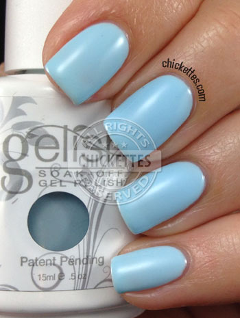 This is Kiss Me, I’m a Prince, a minty pastel green. The only color that is close to this one is Seafoam, so I’ll be sure to compare them. Kiss Me, I’m a Prince is a bit lighter/brighter than Seafoam.

 All Haile the Queen is a pinkish lilac shade. It’s more pink than I was anticipating. It’s similar to It’s a Lily, only lighter. I’m very afraid that this one may be a fader, so I’ll keep an eye on it for a couple of days. The color when it’s wet is more lilac than after it cures. You can see the color difference when applying additional coats.

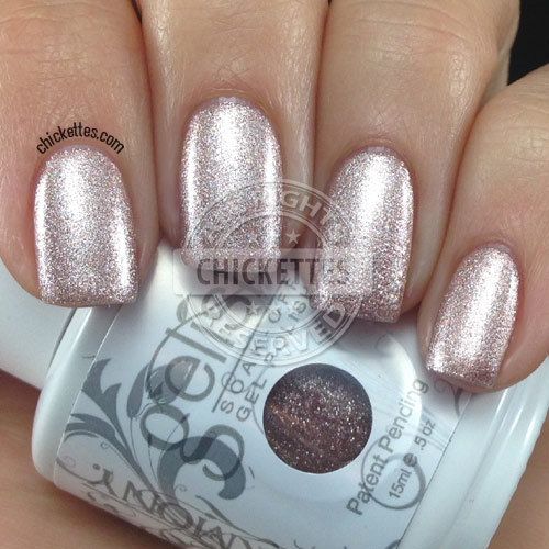
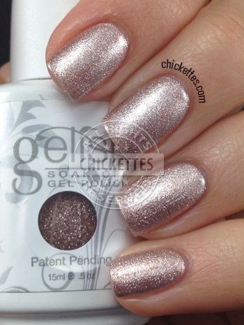
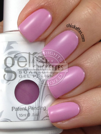 Oh What a Knight! is a shimmery metallic color that I would call a pinkish bronze. I wasn’t sure that it worked well with my skin tone when I first applied it, but it grew on me. It’s definitely a unique color and the finish is really nice. Be careful when applying though because it could show some brush strokes.
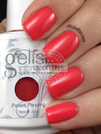
 Fairest of Them All is a gorgeous coral color, but was a bit hard to photograph. It may be slightly lighter in person than it appears in my pictures. It’s darker than Sweet Morning Dew, but lighter than Tiger Blossom.

 And finally this is She’s My Beauty, which is a dusty rose shade. I thought this color would have a little more pink in it. It’s a bit dull for my taste. It reminds me of Exhale, but is definitely lighter. She’s My Beauty looks a lot like the Daisy gel shade that I just swatched called Butternut Squash.

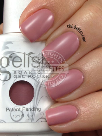 So which ones are your favorites of the bunch?! I love the pastels.
Gelish Once Upon a Dream Fade Report & Comparisons

 I reported that it appears that All Haile the Queen fades to a lighter shade of pink and is less lilac, and that She’s My Beauty fades to a more brown-ish color though it’s very subtle. After two days I did another test on all of the swatches. This time I applied a fresh coat of color in a diagonal across the tips of all of the swatches, cured and then applied a top coat and cured again. Here is what these two colors looked like after this process… I have to say that I may need to retract my statement about She’s My Beauty because I no longer notice much of a color difference. If there is a difference, it’s VERY VERY subtle… though All Haile the Queen has definitely faded. This is only a two-day test, so there is a possibility of further fading after wear of one to two weeks.
 The other colors all held up well and I didn’t notice any color differences at all. You can see the line where I applied the fresh coat, but as I move these swatches around in the light there is no color difference, just the texture bump where the new polish is applied. Again, this is only a two day test, but most gel polishes that fade will show a difference within this timeframe.
 So onto the next question… how do the new colors compare with existing ones? I compared Fairest of Them All with Sweet Morning Dew & Tiger Blossom, and it’s right in the middle of the two. It’s a couple shades darker than Sweet Morning Dew and a shade or two lighter than Tiger Blossom and also a little more coral.
All Haile the Queen is seen next to It’s a Lilly, and is visibly much lighter.
And I put She’s My Beauty next to Mauvy Mauve. These two are actually fairly close, but She’s My Beauty is a little more brown-ish. Also Mauvy Mauve is one of the colors that’s only available in mini size. I would have liked to also compare these with Exhale, but I no longer own that color and couldn’t find my swatch of it.
You can click on the image below to enlarge.
 Here you can see that I put My One Blue Love next to Up in the Blue. My One Blue Love is the palest blue currently available in the Gelish line. Up in the Blue is a known fader and this swatch is old, so this is in it’s faded form.
I compared Kiss Me, I’m a Prince with Seafoam and A Mint of Spring. It’s the lightest minty green of the bunch, but only by a couple of shades.
A Mint of Spring looks a little more green in the photo above than it actually is, so here is another quick shot of these three.
Gelish Trends – All that Glitters is Gold & Am I Making You Gelish? Swatches

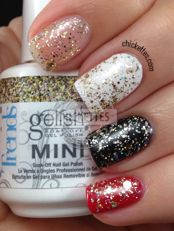
This is All that Glitters is Gold.
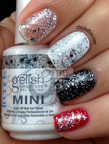
And this is Am I Making You Gelish?
Gelish Year of the Horse 2014

I’m a little late, but we’re now in The Year of the Horse according to the Chinese zodiac. The Year of the Horse started January 31, 2014 (the Lunar New Year) and runs through February 18, 2015. Last year was The Year of the Snake, and I did some nail art with the corresponding Gelish collection which you can see here.
I posted some swatches and comparisons of the new Gelish Year of the Horse collection a couple of weeks ago (click here to see those). This collection comes with two gel polishes, a red called Red-y For the Festival, and a glitter topper called Kick Off the New Year and two regular nail polishes from the Morgan Taylor line. The red isn’t really unique since it’s very similar to other reds in the Gelish line, but it’s very opaque and has better coverage than the others. Kick Off the New Year is an awesome glitter topper with holographic hex and bar glitter.
For this manicure I applied Kick Off the New Year over two coats of Night Shimmer on the accent nail to give it more of a silvery effect. I found some horse water decals on LuckyStarStyle that I thought would be perfect for a mani with this collection. Unfortunately these particular decals were very rigid and didn’t want to bend to fit the shape of my nail, so this didn’t turn out as great as I had hoped. It doesn’t look so bad in the photo because of the angle, but the horse’s nose and tail were sticking up off of the nail. I was going to stamp some patterns over the red nails, but I honestly was too frustrated after trying to get the decal to lay flat that I opted for the easy way out and just added a few gemstones instead.

Gelish Day Dream Confetti – Limited Edition
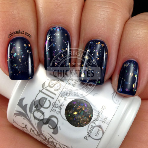
I happened to get my hands on a bottle of a limited edition Gelish polish called Day Dream Confetti. It’s a flakie topper and was exclusively for sale for a limited time at Cosmoprof stores (which is for pros only) on Black Friday of last year. You can read more about this here. There was also a matching Morgan Taylor nail lacquer. If you have access to Cosmoprof you may still be able to find these, but no guarantees. I was fortunate enough to have a friend pick this up for me.
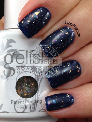
Day Dream Confetti is what I expected the Trends polish Rough Around the Edges to look like. It has different colored iridescent flakes in a clear base, and it looks completely different depending on what base color you wear underneath. I applied one coat of this topper over Gelish I Heart My Instructor, a very dark blue. With just one layer of top coat over it, this polish is completely smooth and flawless. If you recall, my Rough Around the Edges was very chunky and lumpy, so this was a pleasant surprise. I’m not quite sure why they made this LE though – I think it would be a great seller!
Gelish Trends: Too Tough To Be Sweet & Feel Me On Your Fingertips Swatches

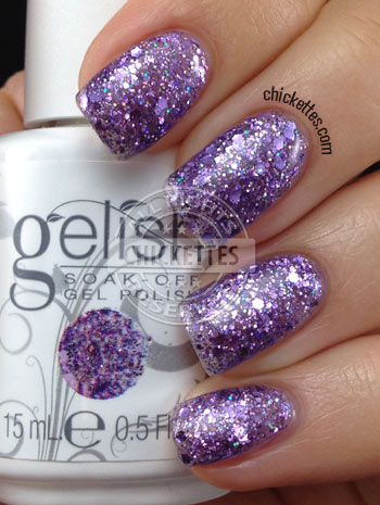
I’m almost done swatching all of the Gelish Trends – only one more to go after today! You can view all of my other ones over on my Gelish swatch gallery page. The first one shown here is Feel Me On Your Fingertips. It’s a purple glitter topper with a clear base. I applied three coats to get it to look like this, but honestly my nails looked and felt way too think. This would probably look better applied thinly over a purple or blue base. You can see that it also has tiny little specks of blue in it too. It’s super gorgeous and sparkly like all of the Trends!
And this is Too Tough To Be Sweet, a pink/cranberry-ish glitter topper. I’ve worn this one a few times with nail art and loved it. This one has a pink tinted base, but it’s pretty sheer even with three coats. In the picture below I have applied two coats of Too Tough To Be Sweet over four different bases: clear, white, black and cranberry (Gelish Rendezvous). I love the look of it over black and cranberry. You can see this color in my recent “Owl Love” mani.

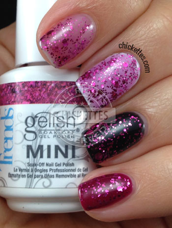 The Trends toppers are a bit hard to remove since I think they are basically glitter in a top coat base, so if you apply multiple layers your nails will be very strong but may take longer to soak off. I recommend using a coarse grit file to file off your top layers before attempting your soak-off to speed up the process.
Gelish Trends Life of the Party Swatch & Collection Overview

Gelish Trends Life of the Party is the last color from the collection that I have to show you. This one is a gorgeous glittery red that reminds me of the ruby slippers in The Wizard of Oz! I think it’s the best red glitter polish yet. In some lights it appears to lean slightly pink. The swatch below shows what it looks like in three coats. This polish wasn’t as thick as some of the other Trends that I tried and it has a red tinted base, so it wears well on its own. I seriously can’t stop staring at my nails!
You can view all of the other Trends swatches over on my Gelish swatch gallery page. I listed the Trends at the top of the page. I have also written about each of the colors in this line, so you can read my write-ups here if you’re interested in learning more about any of them. Overall I really like the Trends line. I didn’t previously consider myself a glitter topper kind of person, but some of these are pretty unique and wear well all on their own without a base color. I loved them all, except for one… Rough Around the Edges. That one just didn’t do it for me, but the others are all winners in my book.
The Trends are a little harder to remove than regular gel polish and require a longer soak-off time, so I recommend filing the top layers well with a coarse grit file before attempting your soak-off. This will make the process go much faster. You can also try applying heat during your soak-off with the use of a heating pad or warming mitts to aid in the removal process.
Below is a picture of my swatch wheel that contains all of the Trends. These are three coats each on a white wheel. The names of each corresponding color are listed below. You can click this image to enlarge it.

1. Concrete Couture
2. Am I Making You Gelish?
3. A Pinch of Pepper
4. Lots of Dots
5. Girls’ Night Out
6. Sweet 16
7. Party Girl Problems
8. Getting Gritty With It
9. Let Me Top You Off
10. Candy Shop
11. All That Glitters is Gold
12. Too Tough To Be Sweet
13. Rough Around the Edges
14. Are You Feeling It?
15. Life of the Party
16. Feel Me On Your Fingertips
Gelish With His Red So Bright
With His Red So Bright has a red jelly base and is loaded with glitter of all sizes. It looks nice in just two coats, but I applied three to make it a little darker.

 I love all of the glittery reds that Gelish offers. Here’s a picture of all of them side by side. The base of With His Red So Bright is similar to Good Gossip, but the glitter is more random.
 P.S. May the Fourth be with you!
 ![]()
Gelish Colors of Paradise Collection (Summer 2014) Swatches

Who’s ready for summer??!! I am! The new Gelish Colors of Paradise collection is full of fun, bright colors for the summer season. I know that many of you have been anticipating these swatches and to see how they compare with the All About the Glow collection. Many of the colors in this set are similar, but they are actually even brighter than the colors from last summer. The purple and dark blue are very unique and are colors that I think would be great to wear year-round. I’m going to work on some comparisons next, so keep an eye out for that post within the next day or two.
The formula of these polishes was good, though I found that I needed three coats for the best coverage. On the official Gelish FB page they posted a tip to apply a coat of white under these colors to make them pop even more, so in each of my swatches the pinky finger has a white base underneath and every finger has three coats of color. In many of them the difference is subtle, but the white base does enhance the colors a bit and it eliminates any visible nail line. The white that I used was Gelish Arctic Freeze since it’s the most opaque and the brightest white in the Gelish line.
I have only done a very basic fade test so far. I put all of my swatch sticks in a window with direct sunlight for a whole day. All of the colors look good after 1 day of exposure, but I think the orange color called Rockin’ the Reef may appear slightly darker (less neon). I’ll keep an eye on them for a couple more days and will report any further findings.
Tahiti Hottie is one of my two favorites from this collection. I was worried that this color would be too similar to You Glare I Glow, but I don’t think they’re alike at all. Tahiti Hottie is more of a reddish purple and reminds me of a vibrant orchid shade. It’s definitely the brightest purple in the Gelish line now. This color is what I imagined Carnival Hangover would look like, but mine turned out to be much more pink.

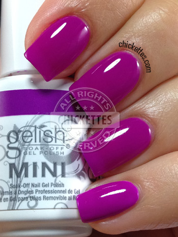 And this is my other favorite from this collection, Mali-Blu Me Away. It’s a perfect bright, medium royal blue. I can see myself wearing this color any time of year… it’s bright enough for spring and summer, yet dark enough for even fall and winter. Love it!

 Rub Me the Sarong Way is a gorgeous, bright shade of teal. It’s similar to Radiance is My Middle Name but is lighter and brighter. It also has better coverage because I have visible nail line with Radiance.

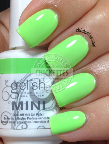
 Lime All the Time is a bright lime green. This color is very similar to A Girl’s Gotta Glow but is lighter and brighter also. It also has better coverage.

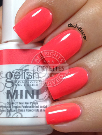
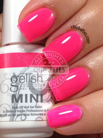
 Pacific Sunset is a VERY bright pink. This color reminds me of barbies and bubble gum! LOL You can see in this swatch that the white base on the pinky made the color much brighter. The formula of this polish was a little thinner than the others and I actually had a slight visible nail line though it doesn’t show in the picture. This color is brighter than Brights Have More Fun and a little more pink.

 Rockin’ the Reef is a very bright orange that leans a little coral. This color is lighter than Tiki Tiki Laranga and much darker than I’m Brighter Than You. It also has better coverage than Tiki Tiki.


